Cool Color Palette: 6 Calming Schemes with Hex Codes & CSS
Six cool color palettes with hex codes, what makes a color cool, and how to keep cool schemes from feeling cold — with copy-paste CSS.
A cool color palette lives on the water side of the color wheel — blues, greens, teals and purples. Cool colors recede, calm the eye, and signal competence, which is why they run the visual identity of tech, finance, healthcare and almost every "trust me" brand on the internet.
Below are six cool palettes with hex codes and copy-paste CSS, plus the theory for building your own. Compare with the warm color palette guide, or browse the full PaletteCSS library.
What makes a color cool?
Cool colors sit roughly between green and violet on the color wheel (hues 75–295) — the shades of water, sky, ice and shadow. They appear to recede from the viewer, making layouts feel airier and more spacious. Even neutrals can be cool: a grey with a blue undertone reads noticeably colder than a beige.
- Cool hues: blue, teal, most greens, purple, blue-pinks.
- Effect: calm, trustworthy, professional, spacious.
- Cool neutrals: slate, silver, blue-grey, cool white.
6 cool color palettes (with hex codes)
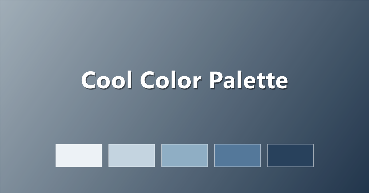
1. Nordic Calm
Icy blues and slate — clean and minimal.
#EDF2F6 · #C4D4E0 · #8FAEC4 · #54789A · #28415C
2. Ocean Depth
From surface aqua to deep water.
#E0F4F4 · #8ED4D4 · #3FA8B0 · #1F6E82 · #0E3A4C
3. Forest Cool
Green-leaning cool for natural, calm brands.
#EAF2EC · #B8D4C0 · #7FAE8E · #4A7C5D · #24422F
4. Twilight Purple
Blue-violet dusk tones — quietly dramatic.
#EFECF8 · #CBC0E8 · #9A85CE · #63489E · #33245C
5. Steel & Sky
Corporate-friendly blues with real contrast.
#F1F5F9 · #B9CCDF · #6E93B8 · #33608E · #122C4C
6. Mint Ice
Fresh green-blues, light and modern.
#E9FBF5 · #B5EDD9 · #72CDB2 · #369981 · #145A4C
How to use cool colors in CSS
:root {
  --cool-bg:     #F1F5F9;
  --cool-mid:    #8FAEC4;
  --cool-accent: #3FA8B0;
  --cool-text:   #122C4C;
}

body { background: var(--cool-bg); color: var(--cool-text); }
A cool gradient feels like clear morning air:
.hero {
  background: linear-gradient(135deg, #C4D4E0 0%, #28415C 100%);
}
Tips for keeping cool palettes from feeling cold
- Add one warm note. A coral button or gold detail instantly humanises a cool interface.
- Prefer off-white to pure white. A hint of warmth in the background stops the "hospital" effect.
- Layer your blues. Two or three related blues create depth; one flat blue everywhere feels corporate-generic.
- Use deep navy instead of black. It keeps text readable while staying inside the cool family.
Frequently asked questions
What colors are cool colors?
Blues, teals, most greens and purples, plus cool neutrals like slate and silver. They sit on the green-to-violet side of the color wheel.
What do cool colors do in design?
Cool colors recede and calm — they make layouts feel spacious, professional and trustworthy, which suits tech, finance and healthcare brands.
How do I warm up a cool palette?
Add a single warm accent (coral, peach, gold) and choose slightly warm off-whites for backgrounds. The contrast makes both temperatures look intentional.
Keep exploring: compare with the warm palette guide, browse cool color palettes, or copy a cool gradient instantly.