Warm Color Palette: 6 Cozy Schemes with Hex Codes & CSS
Six warm color palettes with hex codes, what makes a color warm, and how to balance warm schemes so they feel cozy instead of overwhelming.
A warm color palette is built from the fire side of the color wheel — reds, oranges, yellows and the browns and pinks that come from them. Warm colors advance toward the viewer, raise energy, and make spaces and screens feel inviting. Restaurants, lifestyle brands, autumn campaigns and cozy product design all run on warmth.
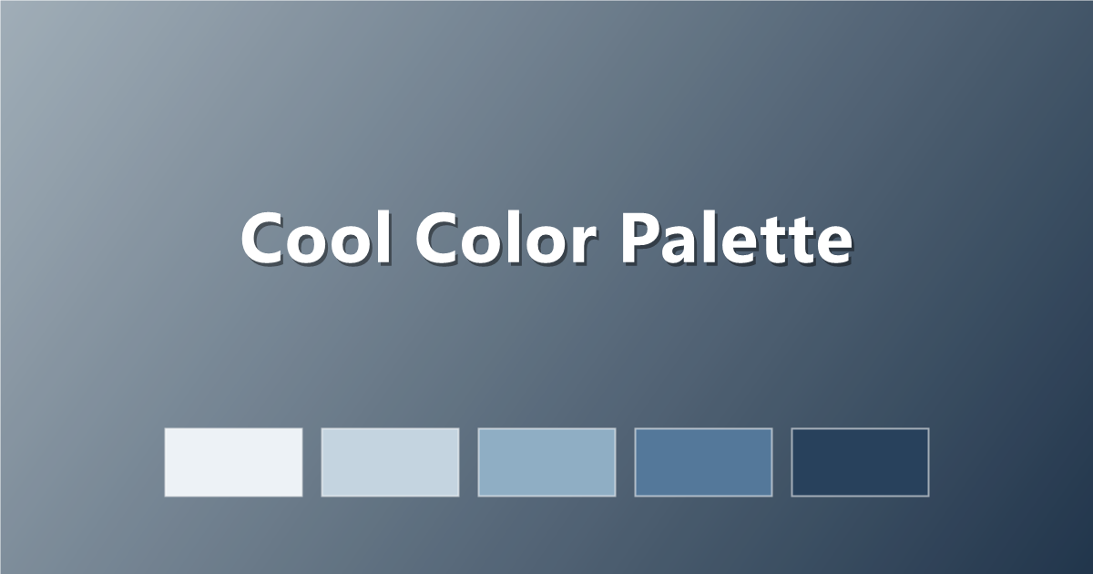
Here are six warm palettes with hex codes and copy-paste CSS, plus the theory for building your own. Compare with the cool color palette guide, or browse the full PaletteCSS library.
What makes a color warm?
On the color wheel, warm colors sit roughly between red and yellow (hues 0–70). They are associated with sunlight, fire and skin — things that radiate heat. Warmth is also relative: a violet with a red lean feels warmer than a violet leaning blue, and even greys can be "warm" when they carry a brown undertone.
- Warm hues: red, orange, yellow, most pinks and browns.
- Effect: energetic, cozy, appetite-stimulating, attention-advancing.
- Warm neutrals: cream, beige, tan, greige — the quiet carriers of warmth.
6 warm color palettes (with hex codes)
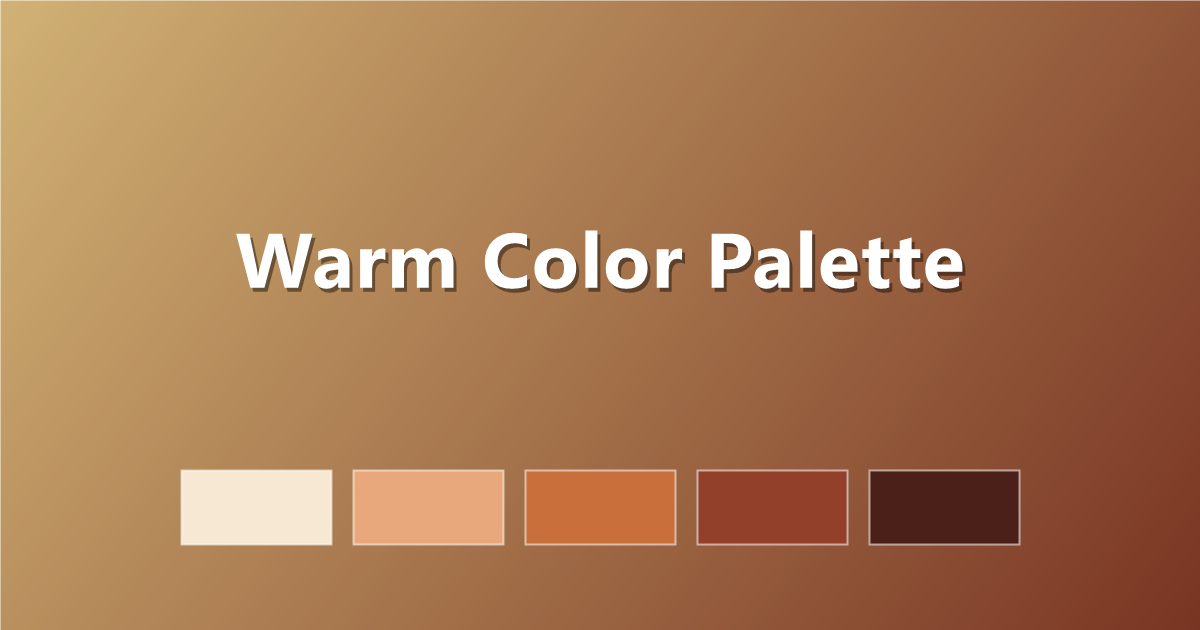
1. Fireside
Deep, cozy reds and ambers.
#F7E8D3 · #E8A87C · #C96F3B · #93402A · #4A2018
2. Golden Warmth
Honey, amber and soft cream.
#FFF6E5 · #FFD98E · #F2A93B · #C97B1F · #6E4310
3. Spiced
Cinnamon, paprika and clove.
#F5E6D8 · #DFA878 · #C26E3E · #8E4A2E · #4E2A1E
4. Warm Blush
Pink-leaning warmth — soft and romantic.
#FBEDE8 · #F5C6B8 · #E89A85 · #C56655 · #7C3A31
5. Autumn Glow
The classic fall spectrum in five steps.
#F9EBD0 · #EDB458 · #D97B29 · #A6481E · #5C2412
6. Warm Minimal
Mostly warm neutrals with one ember accent.
#F8F3EC · #E7DACB · #C9B49C · #8A7360 · #D95B33
How to use warm colors in CSS
:root {
  --warm-bg:     #F8F3EC;
  --warm-mid:    #E8A87C;
  --warm-accent: #C96F3B;
  --warm-text:   #4A2018;
}

body { background: var(--warm-bg); color: var(--warm-text); }
A warm gradient glows like late sunlight:
.hero {
  background: linear-gradient(135deg, #FFD98E 0%, #C96F3B 100%);
}
Tips for balancing warm palettes
- Vary lightness aggressively. All-warm palettes can turn muddy; a very light cream and a very dark brown give them structure.
- One vivid, the rest muted. Let a single hot accent burn against calmer, dustier warms.
- A pinch of cool helps. A muted teal or deep navy detail makes the warmth feel intentional rather than airless.
- Use warm greys. Pure cool grey looks alien inside a warm scheme — choose greige and taupe instead.
Frequently asked questions
What colors are warm colors?
Reds, oranges, yellows, most pinks and browns, plus warm neutrals like cream, beige and tan. They sit on the red-to-yellow side of the color wheel.
What do warm colors do in design?
Warm colors advance visually, raise energy, and create a sense of coziness and appetite — ideal for food, lifestyle and seasonal designs.
Can I mix warm and cool colors?
Yes — the strongest designs usually lead with one temperature and use the other as a small counterpoint, like a navy accent inside a warm cream-and-terracotta scheme.
Keep exploring: compare with the cool color palette guide, browse warm color palettes, or copy a warm gradient in one click.