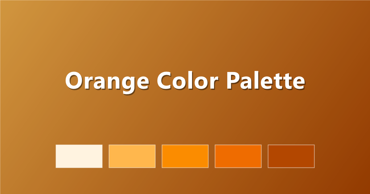
Orange Color Palette: 6 Energetic Schemes with Hex Codes
Six orange color palettes with hex codes — from soft peach to burnt orange and amber — plus what orange means in design and copy-paste CSS.
Orange is the friendliest color in the spectrum — warmer than yellow, less aggressive than red. A well-built orange color palette radiates energy, optimism and approachability, which is why it powers everything from food delivery apps and fitness brands to autumn campaigns and creative portfolios.
Below are six orange palettes with hex codes and copy-paste CSS. For neighbouring warm schemes, see the red palette guide and yellow palette guide, or browse the full PaletteCSS library.
What orange communicates
Orange blends red's energy with yellow's cheerfulness. Bright oranges feel playful and urgent (that's why sale banners love them); burnt and terracotta oranges feel earthy and artisanal; soft peaches feel warm and gentle. Orange also stimulates appetite, making it a staple of food branding.
- Bright orange — energetic, attention-grabbing, youthful.
- Burnt orange — earthy, retro, sophisticated.
- Peach and apricot — soft, friendly, romantic.
- Amber and marigold — golden, optimistic, premium.
6 orange color palettes (with hex codes)
1. Classic Orange Scale
A clean ramp from cream to deep rust.
#FFF3E0 · #FFB74D · #FB8C00 · #EF6C00 · #B34700
2. Burnt Orange
Earthy and retro — a 70s favourite that's back.
#F7E8D8 · #E8A87C · #CE6A3B · #9C4722 · #5E2A1E
3. Peach Soft
Gentle and warm for friendly, calm designs.
#FFF1E6 · #FFD9BD · #FFB48A · #F28B5C · #C55A2E
4. Orange & Navy
The high-contrast classic — warm energy on cool depth.
#F8F4EC · #FF8A3D · #E65C0F · #1D3557 · #0E1E33
5. Amber Glow
Golden-orange warmth, rich and premium.
#FFF6DE · #FFD666 · #FFAB2E · #E07B00 · #8A4B00
6. Terracotta Sunset
Clay tones fading into dusk.
#F9E4D4 · #EDA47E · #D97B54 · #A64F33 · #5C2E22
How to use orange in CSS
:root {
  --orange-50:  #FFF3E0;
  --orange-200: #FFB74D;
  --orange-400: #FB8C00;
  --orange-600: #EF6C00;
  --orange-900: #B34700;
}

.button { background: var(--orange-400); color: #fff; }
An orange gradient brings instant warmth:
.hero {
  background: linear-gradient(135deg, #FFB74D 0%, #B34700 100%);
}
Tips for designing with orange
- Use it as the accent, not the base. Orange is loud — a white or navy layout with orange highlights beats an orange wall.
- Pair with cool blues. Navy and teal are orange's complementary partners and calm it beautifully.
- Go burnt for sophistication. If bright orange feels too playful, terracotta and rust read as premium and grown-up.
- Never use mid-orange for body text. It almost always fails contrast — keep it for buttons, badges and headings on dark backgrounds.
Frequently asked questions
What is a good orange hex code?
A versatile orange is #FB8C00; for burnt orange use #CE6A3B, and for a soft peach try #FFB48A.
What colors go with orange?
Orange pairs best with navy, teal, cream, charcoal and warm browns. Navy is the classic complementary pairing with the strongest contrast.
What does orange represent?
Orange represents energy, friendliness, optimism and appetite. Bright oranges feel playful and urgent, while burnt oranges feel earthy and artisanal.
Keep exploring: browse orange color palettes, see the fall palette guide, or copy an orange gradient instantly.