Yellow Color Palette: 6 Cheerful Schemes with Hex Codes
Six yellow color palettes with hex codes — from soft butter to mustard and gold — plus how to use yellow without hurting readability, with copy-paste CSS.
Yellow is pure optimism — the color of sunshine, energy and attention. But it is also the trickiest color to design with: used well, a yellow color palette feels joyful and confident; used carelessly, it becomes unreadable and overwhelming. This guide gives you six yellow schemes that work, plus the rules that keep yellow friendly.
Grab the hex codes below, and explore neighbouring warm schemes in the orange palette guide or the full PaletteCSS library.
What yellow communicates
Yellow is the most visible color to the human eye — that's why taxis, warning signs and sale tags use it. In branding it signals happiness, energy, and affordability. Soft butter yellows feel gentle and welcoming; mustard feels retro and sophisticated; gold feels premium.
- Butter and cream yellow — soft, warm, calming.
- Sunshine yellow — loud, happy, attention-grabbing.
- Mustard — earthy, vintage, editorial.
- Gold and amber — luxurious and rich.
6 yellow color palettes (with hex codes)
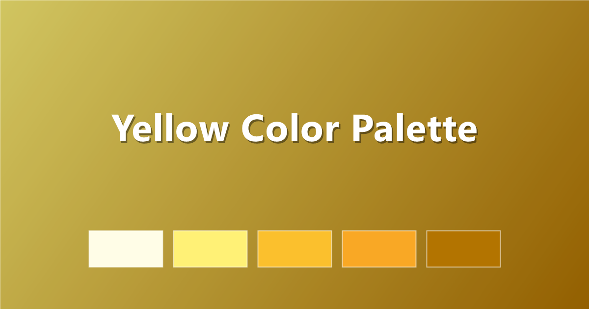
1. Classic Yellow Scale
From pale lemon to deep amber.
#FFFDE7 · #FFF176 · #FBC02D · #F9A825 · #B37400
2. Butter Soft
Gentle morning-light yellows.
#FFFBEA · #FFF3C4 · #FCE588 · #F0B429 · #8A5B00
3. Mustard Vintage
Earthy retro warmth — very editorial.
#F7F0DC · #EAD177 · #D4A72C · #A67B10 · #5C450C
4. Yellow & Charcoal
The bold high-contrast duo (think taxis and warning tape — refined).
#FFF9E6 · #FFD23F · #F0A500 · #3A3A3A · #161616
5. Honey Gold
Warm, premium, golden-hour glow.
#FFF6DE · #FFDF8E · #EDB53E · #C58917 · #6E4D00
6. Lemon Fresh
Zesty yellow-green energy.
#FDFFE0 · #F4F58A · #E3D944 · #A3A017 · #55530C
How to use yellow in CSS
:root {
  --yellow-50:  #FFFDE7;
  --yellow-200: #FFF176;
  --yellow-400: #FBC02D;
  --yellow-600: #F9A825;
  --yellow-900: #B37400;
}

.badge { background: var(--yellow-400); color: #161616; }
A golden gradient adds instant warmth:
.hero {
  background: linear-gradient(135deg, #FFF176 0%, #F9A825 100%);
}
The yellow readability rules
- Never put yellow text on white. Even dark yellows barely pass contrast — yellow is a background and accent color, not a text color.
- Pair yellow with near-black. Charcoal text on yellow passes contrast easily and looks striking.
- Small doses win. A yellow highlight, button or underline energises a neutral design; a yellow page exhausts it.
- Warm your neutrals. Cream and warm grey sit better next to yellow than pure white.
Frequently asked questions
What is a good yellow hex code?
A versatile yellow is #FBC02D; for soft butter use #FCE588, for mustard #D4A72C, and for gold #EDB53E.
What colors go with yellow?
Yellow pairs well with charcoal, navy, white, warm grey and teal. Charcoal gives the strongest, most readable contrast.
Can I use yellow for text?
Only on very dark backgrounds. On white, yellow text fails accessibility contrast — use yellow for backgrounds, buttons and highlights instead, with dark text on top.
Keep exploring: browse yellow color palettes, read what colors go with yellow, or copy a golden gradient in one click.