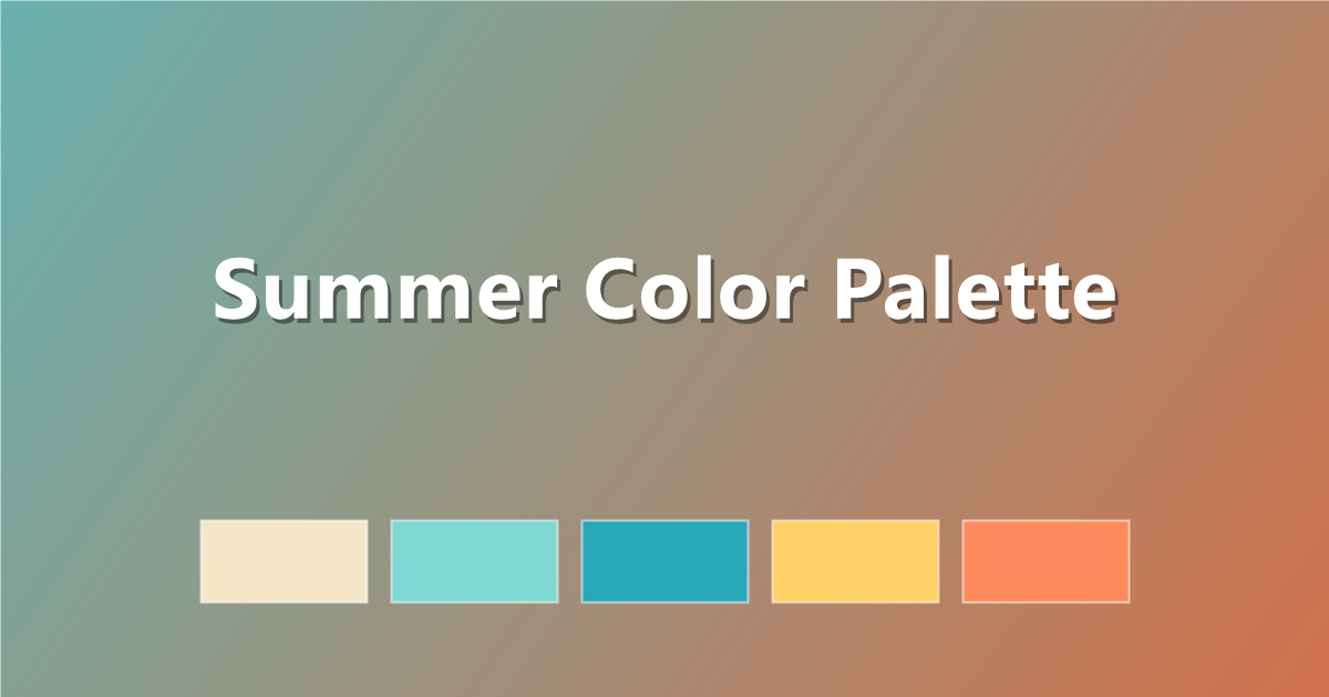
Summer Color Palette: 6 Sun-Soaked Schemes with Hex Codes
Six vibrant summer color palettes with hex codes — ocean blues, citrus brights and golden sunset tones — plus copy-paste CSS for warm-weather designs.
Nothing says energy like a summer color palette. Summer colors are bright, sun-washed, and instantly uplifting — turquoise water, citrus fruit, golden light, and poolside pastels. They are perfect for seasonal campaigns, travel brands, event invitations, and any design that needs to feel warm and alive.
Below are six ready-to-use summer palettes with hex codes and copy-paste CSS. Want more warm-weather inspiration? Browse the full PaletteCSS library or pair these with our sunset color palette guide.
What makes a palette feel like summer?
Summer palettes share three traits: high brightness (everything looks sunlit), warm-cool contrast (hot corals against cool ocean blues), and saturated accents borrowed from nature — citrus yellow, watermelon pink, palm green. The mood ranges from energetic beach-club brights to soft, hazy vacation pastels.
- Ocean blues and aqua — the cooling base of most summer schemes.
- Citrus yellow and orange — sunshine in color form.
- Watermelon and coral pinks — playful warm accents.
- Sandy neutrals — beige and cream keep it grounded.
6 summer color palettes (with hex codes)
1. Beach Day
Classic sand, sea and sky — calm and fresh.
#F5E6C8 · #7FD8D4 · #28A8B8 · #1B6E8C · #FF8A5C
2. Citrus Splash
Lemon, lime and orange — pure energy.
#FFF3B0 · #FFD23F · #FF9A00 · #8AC926 · #2A9D8F
3. Tropical Punch
Bold vacation brights for playful brands.
#00B4D8 · #06D6A0 · #FFD166 · #EF476F · #FF8FA3
4. Poolside Pastel
Soft, hazy summer for airy designs.
#CDEFF5 · #A8E6CF · #FFF1B6 · #FFC8A2 · #F8A1C4
5. Golden Hour
Late-afternoon warmth, honey and peach.
#FFE8C2 · #FFC971 · #FF9E4F · #E76F51 · #6D4C3D
6. Watermelon
Sweet pink-and-green contrast that pops.
#FDE8E9 · #FF8FA3 · #F94A6B · #3E9C6D · #1E5941
How to use summer colors in CSS
Save your summer palette as CSS variables:
:root {
  --summer-sand:  #F5E6C8;
  --summer-aqua:  #28A8B8;
  --summer-coral: #FF8A5C;
  --summer-deep:  #1B6E8C;
}
A bright diagonal gradient makes an instant summer hero section:
.hero {
  background: linear-gradient(135deg, #7FD8D4 0%, #FFD166 60%, #FF8A5C 100%);
}
Preview and copy more like this in the CSS gradient gallery.
Tips for designing with summer colors
- Balance hot with cool. Pair every warm coral or yellow with an aqua or blue so the design refreshes rather than overheats.
- Use white generously. Bright colors need breathing room — white space keeps summer palettes crisp instead of chaotic.
- Reserve the hottest color for action. A single watermelon-pink button pops hardest when it is the only one.
- Check text contrast. Sunny yellows and aquas usually fail for body text — keep them decorative and use a deep navy or charcoal for words.
Frequently asked questions
What colors are in a summer palette?
Summer palettes combine ocean blues and aquas, citrus yellow and orange, coral and watermelon pinks, and sandy neutrals — bright, sunlit colors drawn from beaches and summer fruit.
What is a good summer gradient?
A reliable summer gradient runs aqua to gold to coral, for example #7FD8D4 → #FFD166 → #FF8A5C at 135 degrees.
Are summer palettes good for websites?
Yes — for seasonal promotions, travel, food and lifestyle brands. Anchor the bright colors with white space and a dark neutral for text, and check contrast for accessibility.
Keep exploring: browse color palettes, see the sunset palette guide, or build a summer gradient and copy the CSS in one click.