Analogous Color Palette: How to Build One (+ 6 Examples)
What an analogous color palette is, how to pick neighboring colors on the wheel, and six ready-made examples with hex codes and CSS.
An analogous color palette uses colors that sit next to each other on the color wheel — like yellow, yellow-orange and orange. Because neighboring hues share an underlying color, analogous palettes are naturally harmonious: nothing clashes, and the result feels cohesive and calm without the effort of matching unrelated colors.
This guide covers how to build an analogous palette from any starting color, plus six ready-made examples. It's part of a color-harmony series alongside monochromatic, complementary and triadic palettes — or explore live on PaletteCSS.
How to build an analogous palette
Analogous colors sit within about 60 degrees of each other on the wheel — close enough to feel related, far enough apart to add variety.
- Pick a base hue — for example, green at 140°.
- Move roughly 30° in each direction — 110° (yellow-green) and 170° (teal-green).
- Vary lightness across the three so one becomes a background, one a midtone, and one an accent.
Unlike complementary palettes, analogous schemes rarely need careful balancing — their natural harmony does most of the work.
6 analogous color palettes (with hex codes)
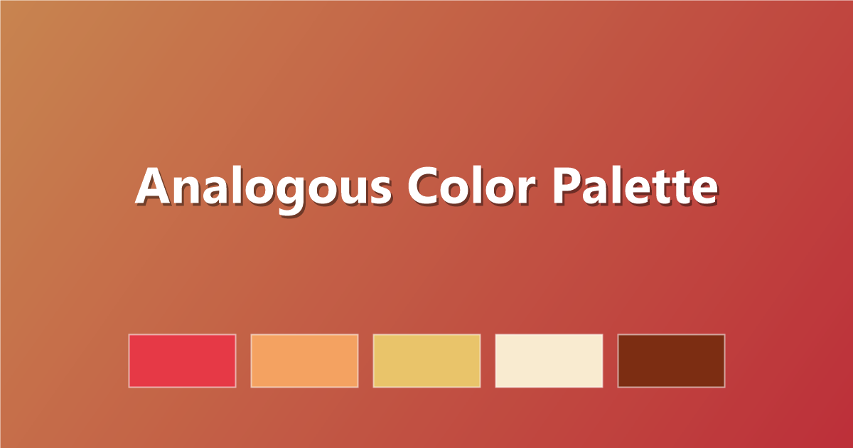
1. Sunset Analogous
Red, orange and yellow — warm and cohesive.
#E63946 · #F4A261 · #E9C46A · #F9EBD0 · #7C2D12
2. Ocean Analogous
Blue, teal and green — cool and calm.
#0F4C81 · #0B6E6E · #2A9D8F · #52B788 · #E8F6F5
3. Berry Analogous
Pink, magenta and purple — rich and romantic.
#DB2777 · #BE185D · #9D174D · #7C3AED · #4C1D95
4. Forest Analogous
Yellow-green, green and teal — natural and fresh.
#A3E635 · #65A30D · #16A34A · #0F766E · #F7FEE7
5. Dusk Analogous
Blue, indigo and violet — moody and elegant.
#1E3A8A · #3730A3 · #5B21B6 · #7C3AED · #EDE9FE
6. Citrus Analogous
Yellow, orange and red-orange — bright and cheerful.
#FDE047 · #FACC15 · #F59E0B · #EA580C · #FFF7ED
How to use an analogous palette in CSS
:root {
  --analog-1: #0F4C81; /* darkest / text */
  --analog-2: #0B6E6E; /* mid / primary */
  --analog-3: #2A9D8F; /* light / accent */
}

body    { color: var(--analog-1); }
.button { background: var(--analog-2); color: #fff; }
.badge  { background: var(--analog-3); }
Tips for analogous palettes
- Vary lightness, not just hue. Three colors of similar lightness can look flat — spread them from dark to light.
- Let one hue dominate. Even in a harmonious palette, a clear lead color prevents the design from feeling indecisive.
- Add a neutral for contrast. A cream or charcoal neutral gives text somewhere to sit clearly, since all three analogous hues can be close in contrast to each other.
- Keep the hue range tight. Straying past about 90° starts to break the "neighboring" feel that makes analogous palettes work.
Frequently asked questions
What is an analogous color palette?
A palette built from colors that sit next to each other on the color wheel, typically within 60 degrees — like yellow, orange and red.
How is analogous different from monochromatic?
Monochromatic uses one hue at different lightness levels; analogous uses two or three distinct but neighboring hues, giving more variety while staying harmonious.
When should I use an analogous palette?
Use it when you want a cohesive, low-tension design — nature, wellness, and lifestyle brands often use analogous palettes because they feel calm and unified.
Keep exploring: try the complementary color palette guide, learn the basics in color theory basics, or build one on PaletteCSS.