Triadic Color Palette: How to Build One (+ 6 Examples)
What a triadic color palette is, how to find three evenly spaced colors on the wheel, and six ready-made examples with hex codes and CSS.
A triadic color palette uses three colors spaced evenly around the color wheel — 120 degrees apart, like the three points of a triangle. Classic examples include red-yellow-blue and orange-green-purple. Triadic palettes are vibrant and balanced at once, offering more variety than a complementary pair without losing harmony.
This guide shows how to build a triadic palette from any color, plus six ready-made examples. It completes a color-harmony series alongside monochromatic, complementary and analogous palettes — or generate one instantly on PaletteCSS.
How to build a triadic palette
- Pick a base hue — for example, blue at 220°.
- Add 120° twice — 220° + 120° = 340° (pink-red), and 340° + 120° = 100° (yellow-green).
- Balance the roles — one color dominant, one supporting, one as a small accent, so all three don't compete equally.
Because triadic colors are evenly spaced, the palette naturally feels vibrant — the challenge is restraint, not finding harmony.
6 triadic color palettes (with hex codes)
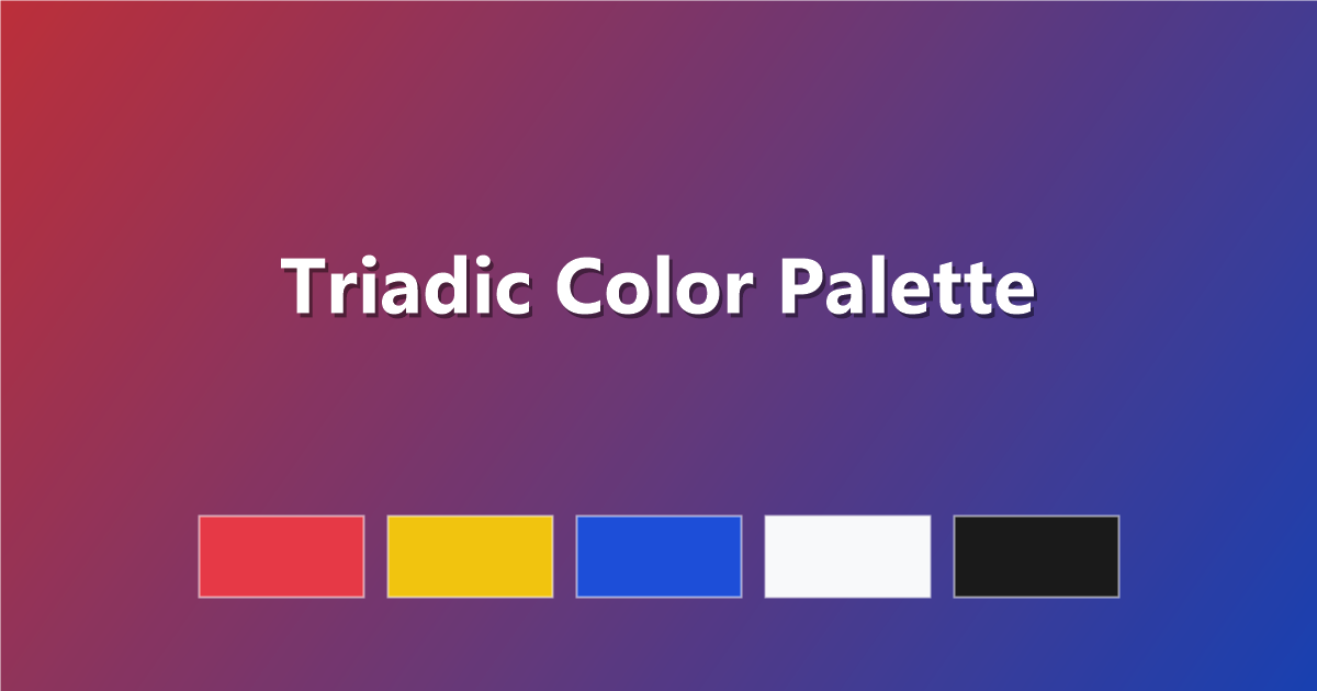
1. Classic Primary Triad
Red, yellow and blue — bold and playful.
#E63946 · #F1C40F · #1D4ED8 · #F8F9FA · #1A1A1A
2. Secondary Triad
Orange, green and purple — rich and balanced.
#F4A261 · #2A9D8F · #7C3AED · #FFF7ED · #1A1A1A
3. Muted Triad
Softer versions of a classic triad — easier to live with.
#C97B7B · #C9B26B · #6B8EC9 · #F5F3EE · #3A3A3A
4. Pastel Triad
Light, airy versions of red-yellow-blue.
#FBC4C4 · #FCE7A8 · #B8D4F0 · #FFFDF9 · #4A4A4A
5. Jewel Triad
Deep, saturated triadic jewel tones.
#7A1F3D · #8A6D00 · #1B3B8C · #0D0D0D · #F1DFA8
6. Vibrant Triad
Maximum energy for bold, youthful brands.
#FF006E · #FFBE0B · #3A86FF · #FFFFFF · #1A1A2E
How to use a triadic palette in CSS
:root {
  --dominant: #F8F9FA; /* mostly used, 60%+ */
  --primary:  #1D4ED8; /* main brand color, 30% */
  --accent:   #E63946; /* buttons/highlights only, 10% */
}

body    { background: var(--dominant); }
.button { background: var(--primary); color: #fff; }
.badge  { background: var(--accent); color: #fff; }
Tips for triadic palettes
- Use the 60-30-10 rule. Let one color dominate, one support, and the third appear only in small doses — three equal colors get visually noisy fast.
- Mute at least one. Softening one of the three hues (lower saturation) keeps the trio from competing for attention.
- Add a true neutral. White, cream or charcoal gives the eye somewhere to rest between the three hues.
- Great for brand systems. Triadic palettes work well when you need a primary color, a secondary color and a distinct alert/accent color.
Frequently asked questions
What is a triadic color palette?
A palette using three colors spaced 120 degrees apart on the color wheel, such as red, yellow and blue — balanced and vibrant at once.
How do I find triadic colors?
Add and subtract 120 degrees from your base color's hue on the color wheel. A tool like PaletteCSS can calculate a triadic set instantly.
Is triadic harder to use than complementary?
It can be, since three strong colors compete more than two — the fix is the 60-30-10 rule: one dominant color, one supporting, one accent.
Keep exploring: try the analogous color palette guide, learn the basics in color theory basics, or generate a triad on PaletteCSS.