Monochromatic Color Palette: How to Build One (+ 6 Examples)
What a monochromatic color palette is, how to build one from any base color in three steps, and six ready-made examples with hex codes and CSS.
A monochromatic color palette uses just one hue in different lightness and saturation levels — one color, many depths. It is the easiest palette to get right (nothing can clash with itself) and one of the most elegant: monochrome schemes look intentional, calm and cohesive with almost no effort.
This guide shows you how to build one from any base color in three steps, plus six ready-made monochrome palettes with hex codes. Prefer to skip the theory? Pick a base color on PaletteCSS and copy its shades directly.
What "monochromatic" actually means
Mono = one, chroma = color. You pick one hue (say, blue at 220°) and create variations only by changing:
- Tints — the hue mixed with white (lighter versions).
- Shades — the hue mixed with black (darker versions).
- Tones — the hue muted with grey (softer versions).
Because every color shares the same hue, harmony is guaranteed — the palette cannot argue with itself.
Build one in 3 steps
- Pick your base. A mid-lightness, mid-saturation version of your hue — for example
#3B82F6for blue. - Create the light end. Raise lightness to ~90% for backgrounds (
#DBEAFE) and ~75% for hovers and fills. - Create the dark end. Drop lightness to ~30% and ~15% for text and headers (
#1E40AF,#172554).
Five steps — two light, one base, two dark — is the sweet spot for a working UI scale.
6 monochromatic palettes (with hex codes)
1. Monochrome Blue
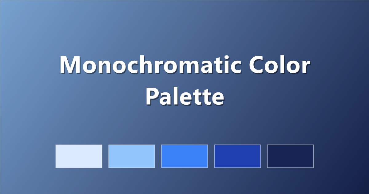
#DBEAFE · #93C5FD · #3B82F6 · #1E40AF · #172554
2. Monochrome Green
#DCFCE7 · #86EFAC · #22C55E · #15803D · #052E16
3. Monochrome Purple
#EDE9FE · #C4B5FD · #8B5CF6 · #6D28D9 · #2E1065
4. Monochrome Rose
#FFE4E6 · #FDA4AF · #F43F5E · #BE123C · #4C0519
5. Monochrome Amber
#FEF3C7 · #FCD34D · #F59E0B · #B45309 · #451A03
6. Monochrome Slate
The grey-blue neutral favourite.
#F1F5F9 · #CBD5E1 · #64748B · #334155 · #0F172A
Map the palette to CSS roles
:root {
  --mono-100: #DBEAFE;  /* backgrounds */
  --mono-300: #93C5FD;  /* borders, hovers */
  --mono-500: #3B82F6;  /* buttons, links */
  --mono-700: #1E40AF;  /* headings */
  --mono-900: #172554;  /* body text */
}

body   { background: var(--mono-100); color: var(--mono-900); }
.button{ background: var(--mono-500); color: #fff; }
Tips for monochrome that doesn't look flat
- Stretch the range. The lightest and darkest steps should be far apart — timid ranges are what make monochrome boring.
- Vary saturation too. Slightly muting the light tints and enriching the dark shades adds sophistication.
- Use white space as a color. Generous white (or near-white tint) keeps a single-hue design breathing.
- Break it deliberately if needed. One tiny neutral or complementary accent (a warm gold in a blue scheme) is allowed — it stops "corporate flatness" instantly.
Frequently asked questions
What is a monochromatic color palette?
A palette built from a single hue varied only in lightness and saturation — tints, shades and tones of one color.
Why use a monochromatic palette?
Guaranteed harmony, effortless cohesion, and a clean professional look. It is the safest palette structure for beginners and the fastest to build.
How many colors should a monochrome palette have?
Five steps works best for interfaces: two light tints, the base, and two dark shades — enough for backgrounds, borders, buttons and text.
Keep exploring: learn the wider rules in color theory basics, try the 3-color palette method, or pick a base color on PaletteCSS and copy its shades.