UI Color Palette: How to Choose Colors for Apps & Interfaces
How to build a UI color palette that actually works in a real interface — roles, states and accessible contrast — with a ready-made example and CSS.
A UI color palette is not the same as a brand palette. A logo only needs to look good; an interface color system has to work across buttons, forms, alerts, and dozens of interactive states, all while staying accessible. This guide covers how to build a UI palette that survives contact with a real product, not just a mood board.
For the branding side of color, see the logo color palette guide. To build your own UI palette visually, use PaletteCSS and export straight to CSS variables.
A UI palette needs roles, not just colors
The biggest mistake in interface design is picking five pretty colors with no job description. A working UI palette assigns each color a role:
- Primary — your main brand color, used for primary buttons and key actions.
- Neutral scale — 5-9 greys from near-white to near-black for backgrounds, borders and text.
- Semantic colors — success (green), warning (amber), danger (red), info (blue) — used consistently for status, never for decoration.
- Accent — a secondary color for highlights, badges, or a "premium" tier.
A ready-made UI palette (with hex codes)
Primary
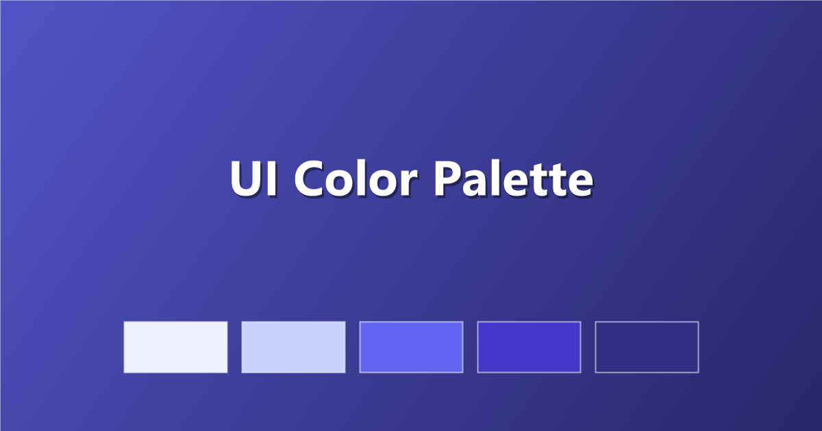
#EEF2FF · #C7D2FE · #6366F1 · #4338CA · #312E81
Neutral scale
#F9FAFB · #E5E7EB · #9CA3AF · #4B5563 · #111827
Semantic: Success / Warning / Danger / Info
#16A34A · #F59E0B · #DC2626 · #0EA5E9
Every color needs its states
In a real interface, one hex code isn't enough per color — buttons need a default, hover, active and disabled state at minimum:
:root {
  --primary:          #6366F1;
  --primary-hover:    #4F46E5;
  --primary-active:   #4338CA;
  --primary-disabled: #C7D2FE;
}

.button {
  background: var(--primary);
}
.button:hover  { background: var(--primary-hover); }
.button:active { background: var(--primary-active); }
.button:disabled { background: var(--primary-disabled); cursor: not-allowed; }
A quick way to generate these: keep the same hue, and shift lightness by roughly 10% per state.
Accessible contrast is not optional
Every text-and-background pairing in your UI needs to meet WCAG AA (4.5:1) at minimum. This applies to body text, button labels, form placeholders and error messages — anywhere a user reads words. Check every pairing before shipping, not just the ones that "look fine."
Tips for building a UI color system
- Build the neutral scale first. Most of any interface is neutral — grey backgrounds, borders and text. Get this right before touching brand color.
- Never assign meaning by color alone. Red for danger should also carry an icon or text label, for colorblind users.
- Keep semantic colors consistent. Green always means success, red always means danger — never repurpose them decoratively.
- Design dark mode as a second scale, not an inversion. Simply inverting light-mode colors usually produces poor contrast — build a deliberate dark neutral scale instead.
Frequently asked questions
What colors should a UI palette have?
At minimum: a primary brand color, a neutral grey scale (5-9 steps), and four semantic colors — success, warning, danger and info.
How is a UI palette different from a brand palette?
A brand palette just needs to look right in a logo or on a poster. A UI palette must also work across hundreds of interactive states while staying accessible — it is functional, not just decorative.
What contrast ratio does a UI need?
WCAG AA requires at least 4.5:1 for normal text and 3:1 for large text (18px+ or 14px bold) — every text-on-background pairing in the interface should be checked against this.
Keep exploring: browse color palettes, read the color theory basics guide, or export a palette straight to CSS variables on PaletteCSS.